Using the Single Edition Template
There are a wide range of different screen sizes that participants can use to complete your questionnaire. These vary from larger widescreen monitors to small mobile phones. When designing a questionnaire or form, it’s important to consider which devices a respondent might use.
Using multiple editions
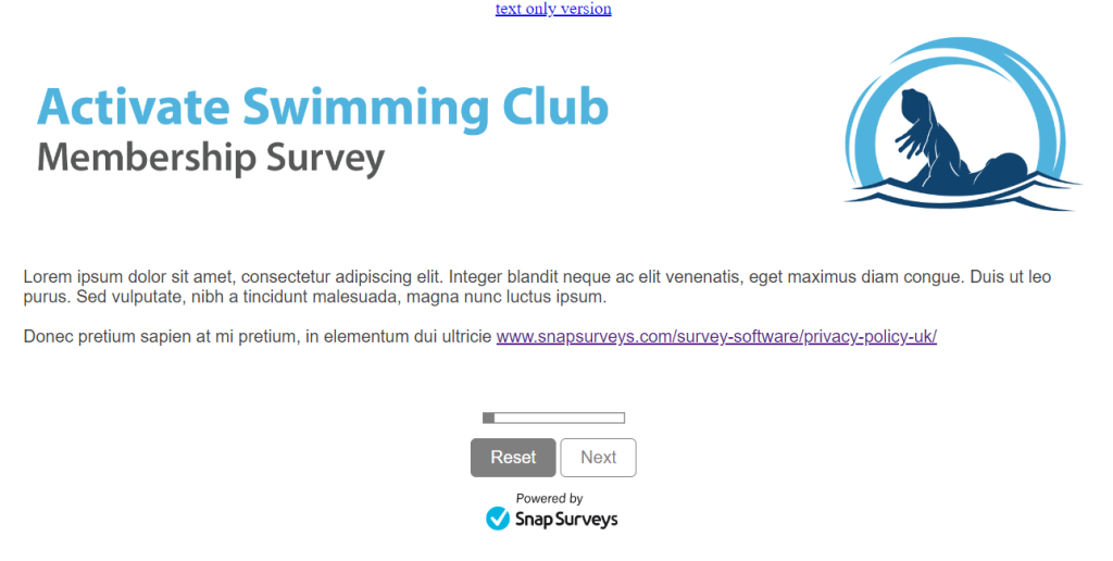
You can a survey that makes use of different editions. The edition presented to the participant is based upon the screen size of the device they are using. This allows the designer to specify how questions are formatted, and which images and logos are displayed. For example, a respondent using a larger device sees a wide banner, whereas someone using a smaller device, sees a smaller image which fits the screen without the need to zoom in or out. This approach provides a more tailored view, but involves more design work.
You can choose from a large selection of supplied survey templates that have multiple editions. Select the survey template when you create a new survey. These templates provide multiple online editions and a paper edition.
Single Edition Template
In many scenarios, there are minimal differences between the editions. For this reason, using a single edition template, which has one online edition that can fit multiple screen sizes, can speed up the survey design process. As with all our supplied templates, there is also a paper edition.
You can select the Blank Single Edition Template when you create a new survey. This provides one online edition and a paper edition.
Single Edition vs Multiple Editions
As with any ‘one size fits all’ approach, there are times when you may require a more custom fit. Here are some considerations to help you decide whether to use the Single Edition Template or a multiple edition template.
Logos and Images
The size of the images and logos affects which option may be best for your project. Typically we would recommend a maximum image size of 600px, scaled (zoomed down) to 50%.
In a Single Edition Template, the width of the questionnaire or form will be the widest image on the page. Using the Single Edition Template works best when your images and logo’s fit on a smaller phone screen (in portrait mode), without the need to zoom out. If they are wider than this, a respondent using a phone will have to either zoom out to see everything on the screen, or scroll left and right to view the full question text.
If you have wider images and logo’s, a multiple edition questionnaire or form displays different images on different sized devices. For example, a larger banner would be shown on a PC, Laptop or Tablet device, and a different smaller image would be viewed on a smaller phone sized device.
Grid Questions (Rating Scales)
Grid question and answer formats can affect which option to choose.
These can include:
- Long questions
- Long answer labels
- Large number of answer labels
With a multiple edition template, a grid question displays as an individual drop-down menu on a phone sized device. This makes it easier to see all the answers on a smaller screen.
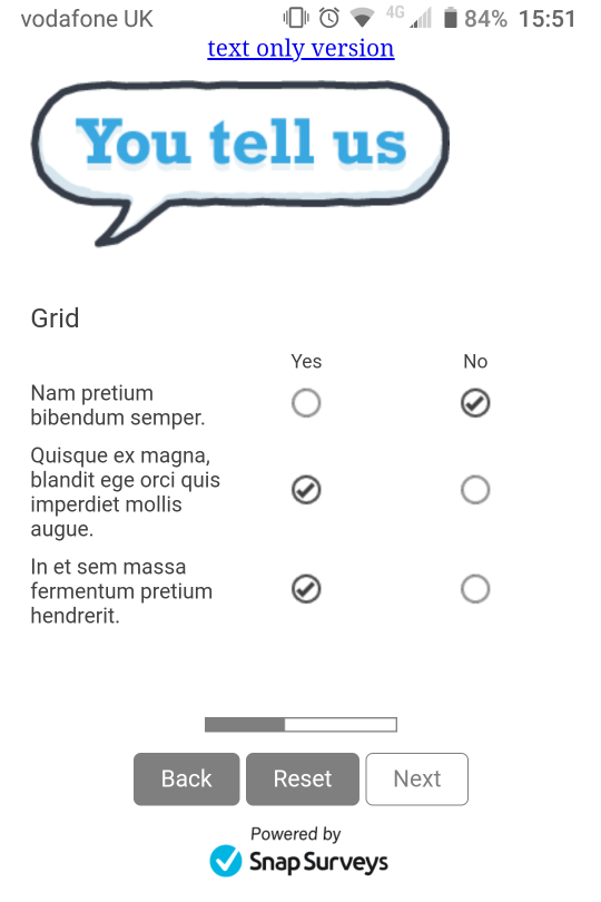
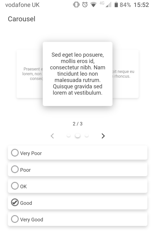
In the Single Edition Template, the question remains in a grid format. On a smaller screen, the question rows and answers are moved closer together to try and fit the screen. This means that longer question and answer text, or a larger number of possible answers can become too close together and difficult to read. If this is the case, it is preferable to use the ‘Carousel’ question style, which makes better use of a smaller screen when there are larger amounts of question and answer text.
If your grid question has a smaller answer set, such as, a simple Yes | No, then the standard grid question style within the Single Edition Template works well on both larger and smaller devices.