Use Chart styles to add branding to your charts
Charts play an important part in analysis and reporting, helping to make the response data easier to understand. You can create chart styles that reflect your organization’s branding, bringing a consistent look to your analysis and reports. In Snap XMP Desktop, the style of a chart determines the background, the colors used on the chart, and the type of chart. The chart styles can be loaded, edited and saved for use in other reports, analyses and surveys.
Snap XMP provides a large number of pre-defined chart styles that can be used as supplied or as the basis for a new style. The pre-defined styles can be edited using the Chart Designer or new styles can be created using the Chart Wizard.
The chart style is made up of three components:
- Layout which defines the type of chart and how it is displayed
- Background which defines the color or images used behind the chart
- Series colors which defines the colors used on the chart
This tutorial shows how to load a pre-defined chart style, use the Chart Designer to edit the chart style and then save the new style. When you save the style you can choose which components are saved in the chart style. Often the chart style is saved with the background and series colors only, so that the style applies these to a chart without changing the layout.
Step 1: Loading an existing chart style
A chart style must be selected when creating a new analysis chart. This can be edited later by loading another existing style or using the Chart Designer. The examples in this worksheet are based on the Crocodile Rock Cafe survey provided with Snap XMP Desktop.
- In Snap XMP Desktop, click Survey Overview
 to view the list of surveys.
 -
Click Online Surveys
 or Offline Surveys
 and open the survey in the Questionnaire window.
- Click Analysis Chart
 on the Snap XMP Desktop toolbar. This opens the Analysis Definition window where you can create a new chart.
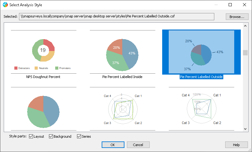
 - Click the Select button. This opens the Select Analysis Style dialog. A thumbnail image is shown for each pre-defined chart style, helping you choose the style you want. Click on the image to select the chart style. The style selected in the tutorial is Pie Percent Labelled Outside. Click OK to select the style.
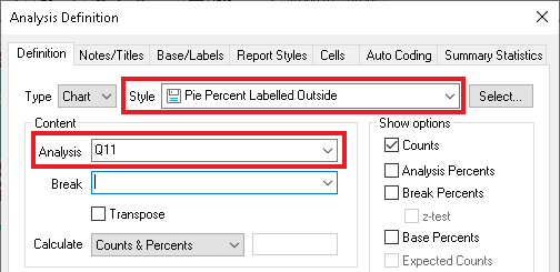
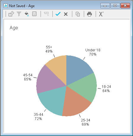
- This example creates a simple chart based on a Single Choice question. The Crocodile Rock Cafe contains a question Q11 that records the participant’s age group. Enter Q11 in the Analysis field. When creating a color style file for your charts, you should work from the most complex chart that you use, in order to ensure that you have enough colors. This question has six choices which each require a different color or color/pattern combination.
- Click OK. This creates the analysis and displays the chart.
- To load another style, right-click the chart and select Load Style from the context menu. This opens the Select Analysis Style dialog again.
- The selection shows the chart style in use. Click on another image to select the new chart style then click OK.
Step 2: Setting a new chart background
The Chart Designer lets you customize each aspect of the chart. This step shows how to replace the background with a picture. The background can also be set to another color.
- Double-click the background of the chart to open the Chart Designer.
- Select Chart in the left hand column, if it is not already selected.
- Select the Picture tab and click the Browse button to choose your picture. Navigate to the folder containing the background image then select the image and click Open.
- In Picture Size, select the best fit for your image. Stretch to Fit will stretch the image to the background of the chart.
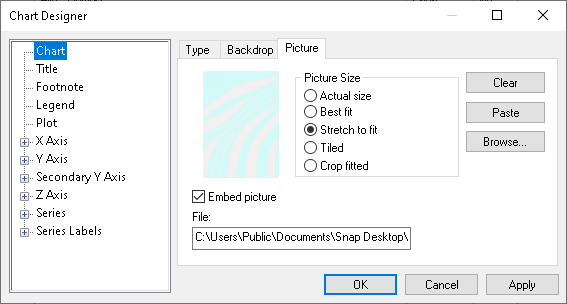
- Click Apply. The Chart Designer dialog remains open and the new background appears on your chart.
Step 3: Setting the series colors
- If the Chart designer dialog is not open, double-click the series item that you wish to change, such as a bar or pie slice. This example starts with the Under 18 series. Select Series | Under 18 | Datapoint defaults | Datapoint1 in the left hand pane.
- Select the Fill tab and change the Fill Color to the required color and click Apply to update the chart.
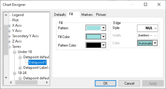
- Select Series | 18 – 24 | Datapoint | Datapoint1 in the left hand pane.
- Select two colors to mix in the Fill color and Pattern color. In this example, we used blue and black respectively. In Pattern, select a textured pattern. The pattern selection displays the colors you have already chosen.
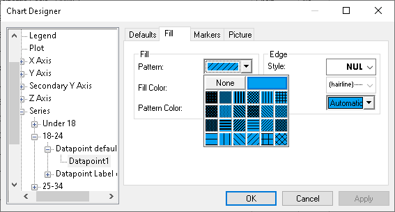
- Repeat the process for each data point in the series. Click Apply if you wish to make further changes, otherwise click OK to close the dialog.
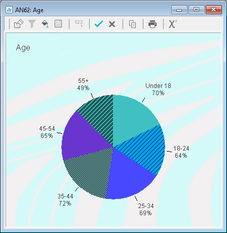
Step 4: Saving the new chart style
- Right click your modified chart and select Save Style from the context menu. This opens the Save Style dialog.
- Enter a name for the new chart style.
- Clear the Layout checkbox but leave the Background and Series checkboxes selected. This saves the chart colors and background only.
- Browse to the location that you wish to save the chart style.
- Click Save to save the chart style.
If you leave the Layout checkbox selected the style is saved with all the chart information and you will overwrite the chart type when you load the style.
Step 5: Testing the new chart style
- Click Analysis Chart
 from the Snap XMP Desktop toolbar.
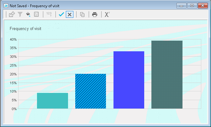
 - In the Analysis Definition dialog, change the style to bar percent, type Q2 in the Analysis box and click OK. This displays a new chart showing a four series element bar chart.
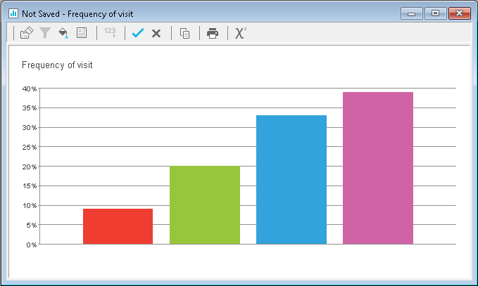
- Right click the chart and select Load Style from the context menu.
- Select the style created in Step 2.
- Clear the Layout box and click OK. The chart will be updated with the new colors and background.
If there is a topic you would like a tutorial on, email to snapideas@snapsurveys.com