Banding quantity variables for analysis
Quantity data provides a continuous set of values which makes it difficult to find out how values are distributed, as every response could be different. Grouping the quantity responses together into banded ranges provides a way of using charts and tables to analyse the quantity data. Usually the data is grouped into equal band intervals to see how the responses are distributed. Choosing how wide the bands are can help you see any important spikes or dips which might average out over a wide band.
To do this, you need to find out what the minimum and maximum value responses are, and use this information to divide the range into equal bands. You can display the minimum and maximum values in a table of descriptive statistics. Once you have decided on the bands, you must sort the responses into those ranges, so they can be used in charts and tables. This is done by creating a derived variable.
Step 1: Decide on the band ranges
In order to split the quantity into bands of equal size, create a table to find the maximum and minimum values and the range. This tutorial uses the Crocodile Rock Cafe survey supplied with Snap XMP Desktop.
- Click Analysis table
 on the Snap XMP Desktop toolbar. This opens the Analysis Definition dialog to create a table.
 - In Analysis, enter Q5, the question that asks for the “Amount spent”.
- In Break, select Statistics table.
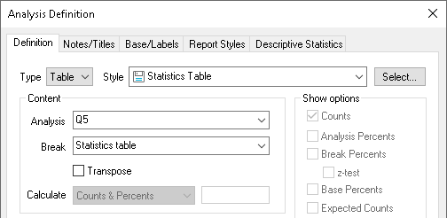
- Click the Descriptive Statistics tab to select the information that will be shown in the table.
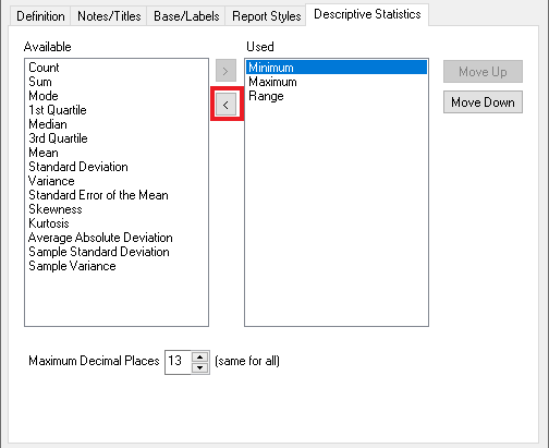
- Use the < button to remove all entries from the Used column apart from the Minimum, Maximum and Range statistics. (You can select multiple entries to move at the same time.)
- Click OK to create your table.

The table shows the top and bottom limits of the bands. For a coarse grain banding, you could split the data into bands of 1 – 21.33 (Low spend), 21.34 – 41.66 (Medium spend) and 41.67 – 62 (High spend). Deciding which band ranges to use can depend on your survey, such as the status of the survey or the intended audience of the analyses and reports that use the banded data. If the survey is live then you may wish to take into account that any new responses may contain data outside the current ranges and extend the bands. If the analysis is used in a report you may want to use whole numbers to make the chart easier to read, for example using 1 to 20 rather than 1-21.33.
Step 2: Create the derived variable
- Click Variables
 on the Snap XMP Desktop toolbar. This opens the Variables window.
 -
Click New Variable
 on the Variables toolbar to create a new variable.
- Enter a Name and Label to describe the variable
- Set the Type to Derived.
- Set the Response to Single.
-
Click Toggle Definitions
 to display the variable definition.
- In Initial Value, enter Q5. This means that the data will be derived from the response in Q5.
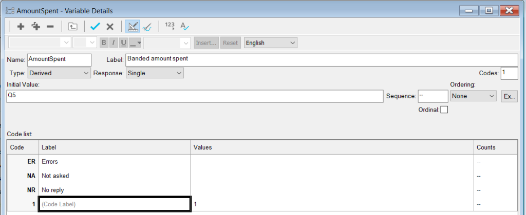
- Click in the empty Code Label field. Enter the bands as shown, using the Tab key to move to the next field and to enter a new code.
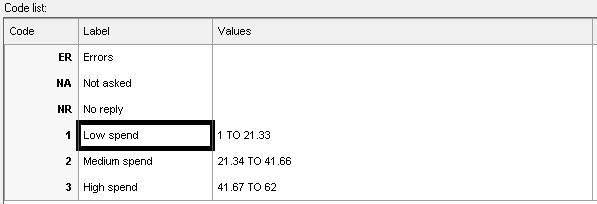
-
Click Save
 to save the new variable.
Step 3: Analyse the quantity data using the bands
- Click Analysis Chart
 on the Snap XMP Desktop toolbar. This opens the Analysis Definition dialog to create a chart.
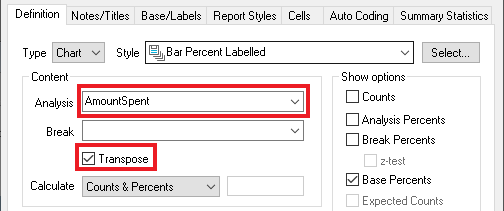
 - In Style, select Bar Percent Labelled. Set the analysis value to the name of your new variable, AmountSpent, and select the Transpose box.
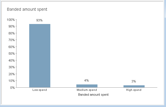
- Click OK to display the bar chart. You can see that nearly all the responses are in the lowest band. For further detail, you will need to redefine your variable or create a new variable with narrower bands.
-
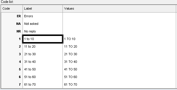
Open the new variable and update the label and values as shown. Click Clone Answer Code
 to duplicate the code, if required.
-
Click Save
 to save your changes.
-
If your chart is still open it will now have Out of Date on the title bar. Click Rebuild
 on the toolbar to update the chart.
Further analysis of the low end values
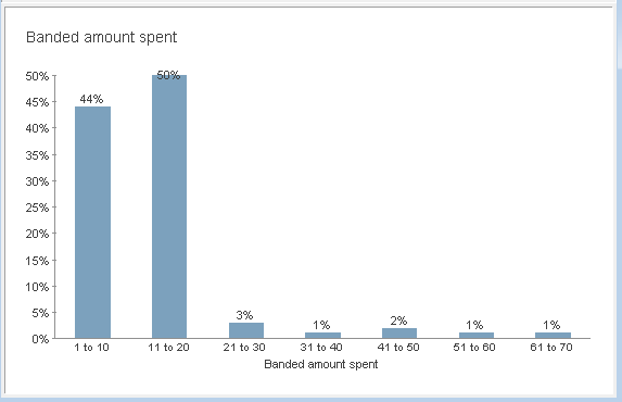
The previous graph shows that most people spent less than twenty pounds in the shop, with the other bands being roughly equal.
You could further analyse the low end spending in a separate graph by cloning the derived variable, AmountSpent and creating bands ranging from 1 to 20. The bar chart analysis is shown.
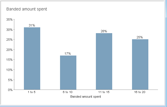
You can see from this that the most popular lower end spend is between one and five pounds.
If there is a topic you would like a worksheet on, email to snapideas@snapsurveys.com