Working with rating scale questions
One of the most useful forms of question is a rating scale, where you ask people to mark how satisfied they were with an item or a service. You can then analyse the answers to these questions to see if people are generally satisfied or dissatisfied, so you are more able to judge where to put the effort in to improve what you offer.
For example, here are five rating questions with a five point scale.
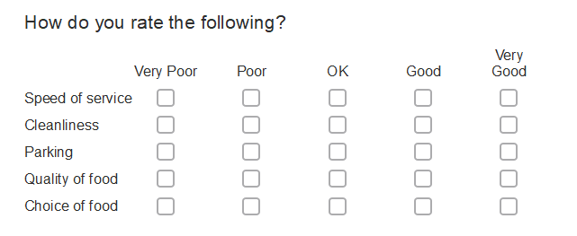
You could use the responses to these questions to help you judge whether you should invest in a larger parking lot or better food.
This tutorial explains some of the issues about using the data as it stands and describes how to set up a three-column table and a simple bar chart to display whether people are generally satisfied or not.
Background
When you are looking at the responses, you need to be careful that you know what is being counted, and that you compare like with like.
For example, how do you compare people’s satisfaction with parking and cleanliness if forty people answer your questionnaire:
- ten people answer the parking question, of whom eight select Good
- forty people answer the cleanliness question, of whom twenty select Good.
To make the comparison useful, you could:
- ignore the people who haven’t responded, and compare the percentage of people who responded who think it is good (in this case 80% think parking is good while 50% think cleanliness is good).
- count the people who hadn’t responded as neutral, and then compare the percentages (20% of all respondents think parking is good while 50% think cleanliness is good)
You need to then display your conclusions clearly.
Here are some of the ways you could display the rating data in tables.
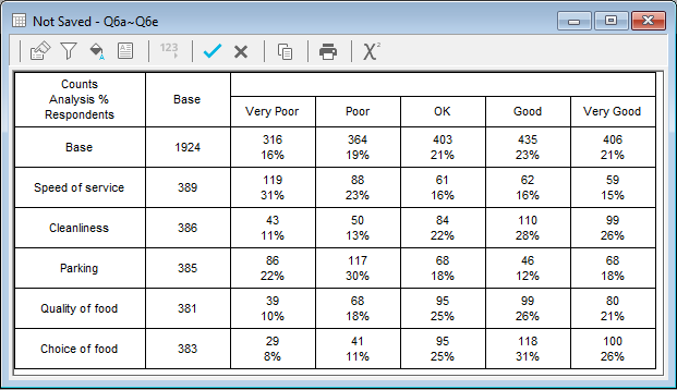
Look at the responses in detail with a grid table
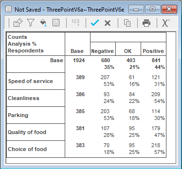
This tells you how many people and what percentage of people, selected which answer to which question. You can find more information about creating grid tables.
Compare the questions as a whole
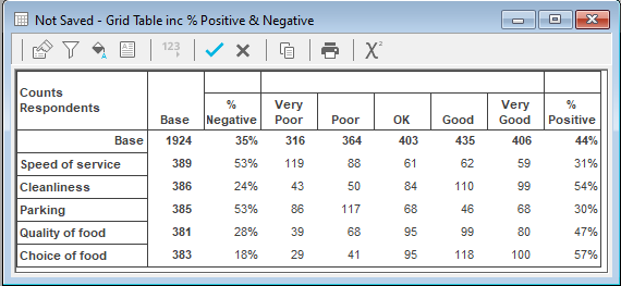
- You could use confidence boxes to group the Poor and Very poor responses together as Negative, and the Good and Very good responses together as Positive and see which question scored highest on Negative or Positive responses. You can find more information about creating a satisfaction scale tables here.
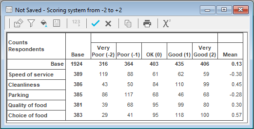
- You could work out a value for all the responses for a question and see which question did best on average. One of the clearest ways of showing this is to give the responses a score ranging from negative to positive. You can find more information about creating a scoring system here.
- You can reduce the table to three columns using derived variables, to make it easy to see the general trends. This worksheet describes how to do this.

This tutorial uses the Crocodile Rock Cafe survey data supplied with Snap XMP and shows you how to create derived variables from the rating questions, so you can display the ratings in a three-column table, as Positive, OK, or Negative. The rating scale questions in the Crocodile Rock Cafe survey are questions Q6.a to Q6.e.
Step 1: Create derived variables for the three columns
You need to create a new variable with 3 codes that represent each five-point rating scale to a three-point rating scale: Positive, OK and Negative.
Create the new variable
- Click Variables
 on the Snap XMP Desktop toolbar to open the Variables window.
 - Click New Variable
 on the Variables window toolbar to create a new variable.
 - Set the Name to ThreePointV6a to remind you that it is a three-point rating scale derived from Q6.a.
- Set the Type to Derived. (The values in this variable are derived from the answers to the rating scale questions.)
- Set the Label to Speed of service.
- Set the Response to Single.
Create the code list
- Click in the Label area for code 1 and type Negative. This is going to be the heading of the column in your analysis.
- Click Tab to move to the Values column.
- Enter an expression to select the Poor or Very poor responses to the rating question. In this example, these are the responses 1 (Very poor) and 2 (Poor). The expression that selects these responses to the appropriate question (Q6a in this example) is Q6a=(1,2). I.e., if the answer to Q6a is either 1 or 2, this variable will have an answer of Negative.

- Click Tab to move to the Label column for code 2 and type OK.
- Click Tab to move to the Values column and type Q6a=3 (i.e., the answer to Q6a is code 3, OK).
- Click Tab to move to the Label column for code 3 and type Positive.
- Click Tab to move to the Values column and type Q6a=(4,5)(i.e., the answer to Q6a is code 4 or 5, good or very good).
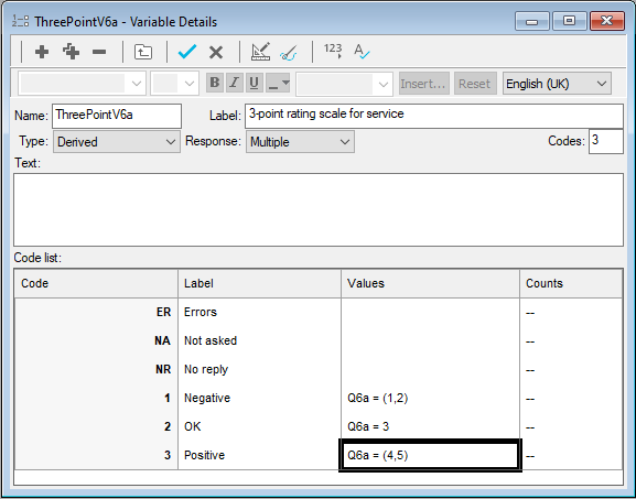
- Click on the Variables window toolbar to check the number of responses for the parts of your new variable. This displays the correct counts.
-
Click Save
 to save your variable.
-
Highlight the variable that you have just created in the Variables window and click Clone Variable
 to create a copy.
- Edit the new cloned variable. Change the variable Name to ThreePointV6b, the Label to Cleanliness and change the question number used in the code values from Q6a to Q6b.
-
Click Save
 to save your variable.
- Repeat cloning and editing the variable for Q6c (Parking), Q6d (Quality of food) and Q6e (Choice of food).
Step 2: Create an analysis table from the derived variables
You can now create analyses based on the new derived variables.
- To create a table, click Analysis Table
 on the Snap XMP Desktop toolbar. This opens the Analysis Definition window for a table.
 - In Analysis, enter ThreePointV6a ~ ThreePointV6e as the analysis expression. (If the variable names are not in sequence, enter them individually, in the format V6a, V6b, V6c, V6d, V6e.)
- Select the Analysis Percents box, so you can see what percentage of people chose each answer.
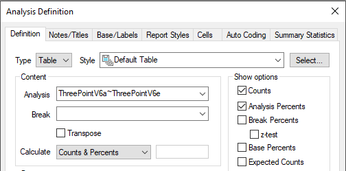
- Click Apply to update the table.
-
Click Save
 to save the analysis table.
Step 3: Create a stacked bar chart from the derived variables
Although the table displays all the information you need, it might be easier to see it in a chart. This step shows creating a stacked bar chart to display the same results.
- Click Analyses
 on the Snap XMP Desktop toolbar to open the Analyses window.
 - Click the analysis table that you have just created in the Analyses window and click Clone Analysis
 to create a copy. This opens the Analysis Definition window.
 - In Type, select Chart.
- Set the Style to Horizontal Stacked Bar Counts Transposed.
- Select Counts and clear Analysis Percents.
- Select Transpose.
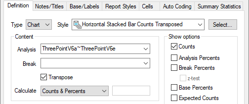
- Select the Notes/Title tab and type Satisfaction ratings as the title of your chart. Clear any values for the Analysis and Break chart axis titles.

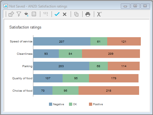
- Click Apply to display the chart. (You may need to drag the definition window away from the chart window.)
-
Click Save
 to save the analysis chart.
The chart shows the satisfaction ratings as a single bar for each question. From the chart, it is easy to see that people are most dissatisfied with Service and most satisfied with Choice of food. The number of responses for each rating is given on that section of the bar.
If there is a topic you would like a tutorial on, email to snapideas@snapsurveys.com