Adding benchmarks and recommendations to reports by overtyping cells
You can enter your own data within a table for use elsewhere by overtyping cell values, and row and column labels in analysis tables.
This is most useful for
- Showing improvement recommendations for the least satisfactory aspects of service
- Showing benchmarked data in tables or charts
This data can be used in an analysis, such as a chart, or displayed in a report using a dynamic reference.
Static benchmarks allow survey results to be presented with reference to previously recorded data. Static benchmarking is most useful where:
- A comparison with published industry figures is required
- Summary figures exist but the raw data is not accessible
Using a benchmark or other static figure in a chart or table
You can add benchmarks or other static figures to your analyses by adding them to a table. If you want to use a static figure in your charts you can do so by adding it to a table analysis and converting the table to a chart. The example described below describes inserting a benchmark in a chart.
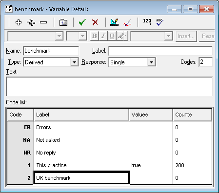
- Set up a derived variable which is true for all cases. This provides a place to store the data.

- Create a cross-tabulation that uses the derived variable.
- Double-click the cell you wish to overtype to show the Override Analysis Value dialog.
- Select the Override radio button.
- Enter the benchmark data in the panel and click OK.
- Repeat for any other cells you wish to overtype.
-
Click
 to display the Results Definition dialog showing the definition of the table you’ve just edited.
- In the Type field, select Chart rather than Table. A cloud or map can also be used.

- Choose an appropriate style.
- Click Apply to convert the overtyped table to a chart. The overtyped data will be used to draw the chart.