Creating a simple means chart of your semantic scale question
This example shows how to produce a chart of the means of a grid of semantic scale questions. It uses the example pictured below (Q7.a to Q7.c)

-
Click
 to display the Analysis Definition dialog for a chart.
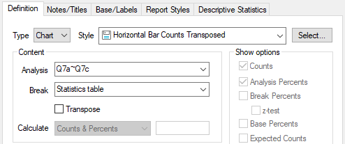
- Select the style Horizontal Bar Counts Transposed in the dropdown list of Styles. Browse for the style if it is not visible
- Add the semantic scale grid variables to the Analysis field. You can add the whole set in the form Q7.a to Q7.c, or you can add individual questions separated by commas.
- Select Statistics table from the dropdown list in the Break field (or type STATS in the field, in upper or lower case).
- Click the Descriptive Statistics tab.
- Show only the Mean in the Used pane.
- Click OK to build the chart.
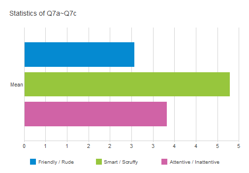
The result is a bar chart showing the mean values of the responses recorded for each of the variables.
Editing the style of your semantic scale chart
If you have created a semantic scale chart using the Horizontal Bar Counts style, you will need to make some adjustments to it to make it appropriate for a semantic scale chart.
You will need to set the axis to have the same values as your semantic scale, and improve the label display
- Click anywhere along the bottom axis to open the appropriate section of the chart designer.

- The chart designer window opens with the Y-axis highlighted.
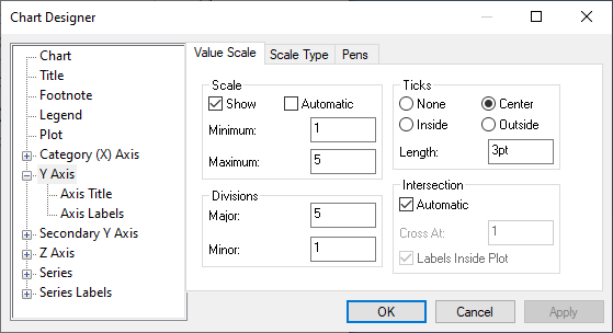
- Clear the Automatic scale box.
- Set the Minimum value of the scale to 1.
- Set the Maximum value of the scale to the number of codes in your semantic scale (5 in this example).
- Set the value of the Major divisions to the number of codes in your semantic scale (5 in this example).
- Click OK to apply the changes to your chart and close the chart designer.
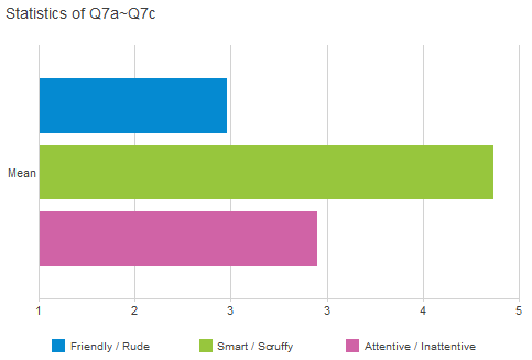
- Save your style changes to use again by right-clicking the chart and selecting Save style and choosing a name and a folder for your new style.
Creating a break-down chart of your semantic scale question
This example shows how to produce a chart of the means of a grid of semantic scale questions broken down by gender. It assumes that you have created a semantic chart style as described in Editing the style of your semantic scale chart.
-
Click
 to display the Analysis Definition dialog box for a chart.
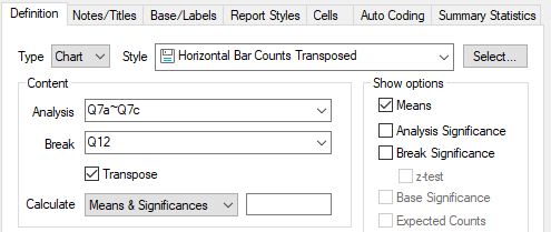
- Set the style to Horizontal Bar Counts Transposed.
- Add the semantic scale grid variables to the Analysis field. You can add the whole set in the form Q7.a to Q7.c or you can add individual questions separated by commas.
- Set the Break field to the variable that you wish to use to break down your responses (Q12, gender in this example).
- Check the Transpose box.
- Set the Calculate field to Means & Significances (any of the Means options will do here).
- Select the Cells tab and set the number of decimal places for the Means to 2. This makes the data comparable to previous examples.
- Click Apply to create your chart.
- Click the labelled axis and set the values to your semantic scale maximum code value as described in Editing the style of your semantic scale chart.
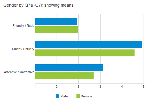
The result is a bar chart showing the semantic scale responses broken down by gender.
