Changing the question boxes
The boxes available in Snap XMP Desktop depend on the type of question and the edition of the questionnaire.
The boxes available for multi-choice questions are displayed in the drop down list next to the Boxes toolbar topic. If you are able to design your own boxes for a question, you can select Image in this list.

You can change the border style and colour and the size and position of the answer box for a literal question.
Using the default boxes
The standard box used in a questionnaire designed in Snap XMP Desktop is a ![]() for both multi choice questions and open-ended questions. These can be easily changed at the level of the entire questionnaire, at the level of question styles, or at the level of individual questions.
for both multi choice questions and open-ended questions. These can be easily changed at the level of the entire questionnaire, at the level of question styles, or at the level of individual questions.
- To change a box for a single question, work in Design Mode

- To change the boxes for all questions in a style or all styles, work in Style Mode

- Select the question that you wish to alter and change the toolbar topic to Boxes.
- Ensure the Style Selection Box is set to the appropriate choice so all questions set to the same style will have the boxes altered.
- Select a new box shape from the images drop down list.
Snap XMP Desktop only displays the box styles appropriate for the document edition you are using.
Displaying multi-choice questions as drop down lists
In the web based editions of a questionnaire, you can display a multi-choice question as:
- labelled boxes
- a drop down list
The Drop-down option is most suitable for Single Response questions, as the Multiple Response version requires use of the Ctrl key on the keyboard to make multiple selections.
By default
- Single Response questions are converted to radio buttons to force the respondent to choose only one answer.
- Multiple Response questions use standard square check boxes so the respondent can make any number of choices.
To switch between the drop down list or boxes:
- Select the style topic Show
- Select the value As Drop-down
- Check the Show box to use the drop down and clear the Show box to use boxes
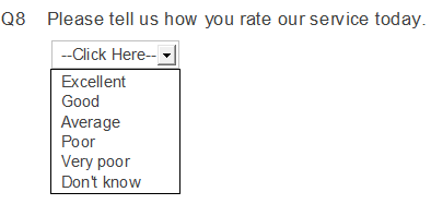
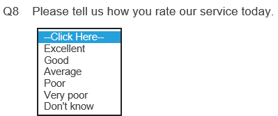
- The question appears differently in the Questionnaire window and the Web browser.
In the Questionnaire window
In the Web Browser
Changing the answer box for Open Ended questions
Open ended or literal response boxes provide a space where the respondent can enter free format data.
You can change the size, border and position of the answer box for an open ended question.
Changing the size
The size of a literal response box can be fixed or proportional. If it is fixed, it is defined by the number of characters it can contain. Fixed box sizes are useful for paper questionnaires and for questions where the answer is of a known length, for example, a date. Proportional boxes are useful for questionnaires displayed on screen, where you do not know the size of the screen used, which could be a smart phone, kiosk or monitor.
You can switch between the Fixed and Scaled box sizes. It may be simplest to set a fixed box size and then convert it.
Setting a fixed box size
- Select Boxes in the toolbar topics list at the top of the questionnaire window.
- Set Size to Fixed.

- Change the Size value. Note that this essentially gives the box area, so if the box is in a narrow space; it expands downwards so all the characters will fit in.
Setting a proportional box size
- Set Size to Scaled.

- Set the % value to the percentage of available space to use.
- Set rows to the number of lines in the box. This determines the box height.
Changing the position relative to the question
The response box can be below the question text or to the right of the question text.
- Select Positions in the toolbar topics list

- Select Beside to put the response box to the right of the question. The question text and response box spaces will get narrower to fit them both into the space.
Changing the border style and colour
- Select Boxes in the toolbar topics list.

- Click Style. The Box Style dialog opens.
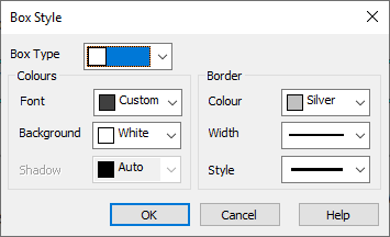
- Select the box colours and border style that you would like.
Specifying a graphic to use as a box
Snap XMP Desktop comes with some pre-defined image files for check boxes and radio buttons. These are in pairs, providing both an empty and a selected version of each graphic.
You can:
- use the pre-defined pairs of Snap XMP Desktop box graphics
- combine the Snap XMP Desktop box graphics into different pairs
- use your own graphics
- Select the question that you wish to alter and change the toolbar topic to Boxes.
- Ensure the Style Selection Box is shows the quesiton style you want to change. In the example below it is set to Multi Choice, so all questions set to the same style (Multi Choice) will have the boxes altered.
- Select Image from the drop-down list of available options.

- The check boxes changes to the default picture box for that style.
- Click the Image button on the Questionnaire toolbar ribbon. The Image Checkboxes dialog appears.
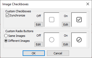
- If you wish to apply a set of four images, defined using the Snap XMP Desktop graphic box naming convention, check the Synchronise box.
- Click the Edit button of the image you wish to change. (Any image if the Synchronise box is checked.)
The Image Properties dialog appears.
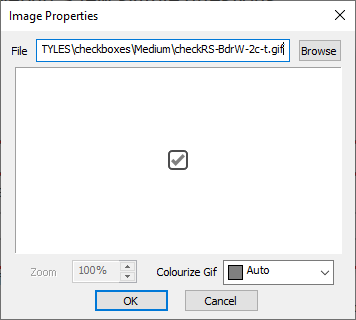
- Click Browse to select a new image file. The Files of type is the type of box that you are editing. If you wish to view graphics files where the file name does not match the convention for the box type, change this setting.
- If you have selected a .gif image, you may tint it by selecting a color in the Colourize Gif box.
- Click OK to use the selected image.
Snap XMP Desktop Graphic Box Naming Convention
Images used for check-boxes can be in .bmp, .gif or .jpg format. They can be of any size or shape. If you are combining images into sets (so you can use the Synchronise feature to have matched boxes), you must use the Snap file naming convention to identify box graphics. If your set of images is identified by Name, Snap XMP Desktop expects the images to have these file names.
|
|
Checked |
Unchecked |
|
Check box |
Check-Name-On |
Check-Name-Off |
|
Radio button |
Radio-Name-On |
Radio-Name-Off |
So, if you have a set of mouth images in gif format, you might call them Check-mouth-On.gif, Check-mouth-Off.gif, Radio-mouth-On.gif and Radio-mouth-Off.gif.