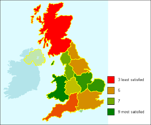
Creating a Map showing ratings scale by area (based on a map graphic)
This example describes how to show a ratings scale by area, with the area data conveyed in the graphic, and the satisfaction statistics displayed by color.
It assumes that:
- You already have a Map Control Editor style representing the country with the different areas defined.
- The respondents’ area is stored in Q11 and their satisfaction level is stored in Q7.
-
Click
 to define the analysis.
- Enter the area variable (Q11) in the Analysis field.
- Select Means and Significances in the drop-down list. Enter the satisfaction variable (Q7) in the field for the variable for which the mean is calculated.
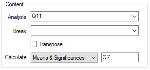
(If you wished to score the mean, you would enter the score in the field after the variable name, e.g. q6.a score5).
- Click OK to save the table. Keep the window open for reference while creating your Map.
- Select the table in the Analyses dialog and click
 on the toolbar to duplicate the analysis.
 - Select Map in the Type list.
- Select the saved style file from the dropdown list of styles.
- Double-click the Map window to open the Map Control Editor.
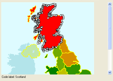
- Click on each area in turn and confirm that the code assignment displayed at the bottom of the window is correct
- If the codes have not been pre-defined, select each area in turn and select Shape|Assign to code. Select the appropriate code for the figure. (You can also right-click the shape and assign codes from the context menu.)
Assigning colors to your areas and displaying a legend
-
Click
 to open the Map Control Editor Fill series dialog.
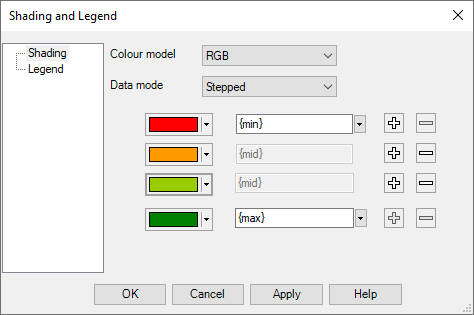
- Select HSL as the color model. This means that intermediate colors will be calculated using a traffic light scheme.
- Select Stepped as the Data Mode. This means that only the colors listed will be seen.
-
Click the
 button twice to add two new data points. There will now be four satisfaction levels displayed. From the table, you know that the maximum satisfaction level is nine and the minimum is three. The extra two data points will be equidistant between the maximum and minimum (5 and 7). Because the Data Mode is Stepped, the areas will be colored according to the nearest data point value, e.g, 4.3 will be classified as 5.
- Select Legend in the left-hand pane.
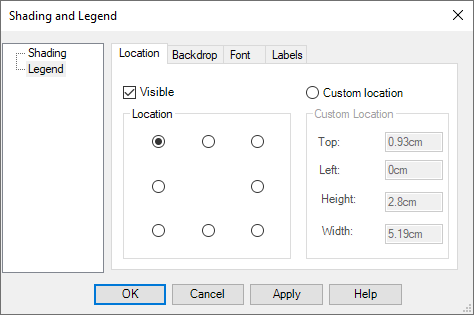
- Check the Visible box to display the Legend, and select one of the radio buttons to position it.
- Click the Labels tab.
- You will have the same number of labels fields as colors in the Shading window. By default the text for each is the value it represents. Add some text to identify what the Map is displaying.
- Click OK.
- When you have finished defining the Map, select File|Save map control and save your Map as a new .isf file. (If you do not save it as a separate file, it will still be stored in your survey, but will not be available to any other surveys or analyses.)
- Click OK to display the completed Map analysis.
