Creating an accessible version of your questionnaire
Accessibility is an important consideration when designing a questionnaire. To ensure everyone is capable of answering questions and having their say, you can create accessible questionnaires in Snap XMP Desktop that conform to Web Content Accessibility Guidelines (WCAG) 2.2 meeting level AA compliance and Section 508 Standards.
By clever design your questionnaires can be accessible to Level A success criteria without utilising the additional Accessibility settings. For example here are some points that will aid in achieving this.
- Include text alternatives for non-text content such as images
- Choose simple, easy to read fonts.
- Don’t rely on colour to convey information
- Ensure foreground and background colours are sufficiently contrasting
- Use of appropriate images to convey meaning and purpose
- Avoid inserting content, which cause flickering, blinking or movement effects
- Link Text for any inserted web links are easy to understand
- Help users avoid mistakes – use descriptive instructions, error messages and suggestions for correction
- Insert custom HTML to implement some accessible features e.g. to denote acronyms
You can also watch the associated webinar that covers how to design an accessible survey.
Please read our Accessibility Statement that covers further information on the various points referenced in this worksheet.
Setting the Accessibility options
In order to produce questionnaires at a higher level of compliance, you need to select publication options that include an additional ‘Plain text’ version. When the survey ispublished with all the available options, it will be compliant to Level AA. In Snap XMP Desktop, you can add the additional accessibility options to your questionnaire.
- In Snap XMP Desktop, open your survey from the Survey Overview window.
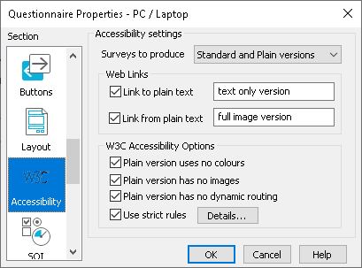
- Click the File | Page Setup menu. This opens the Questionnaire Properties dialog.
- In Section, select the Accessibility option.
- In the Surveys to Produce list, select Standard and Plain versions.
- Select the option for Link from plain text and include some appropriate text. The link text which is chosen should be clear and unambiguous to conform to checkpoint 2.4.4 & 2.4.9.

- When your questionnaire is viewed in a browser a link is displayed that allows participants to move between the two versions of the questionnaire.
- By default the W3C Accessibility Options for Plain version uses no colours, Plain version has no images and Plain version has no dynamic routing are selected.
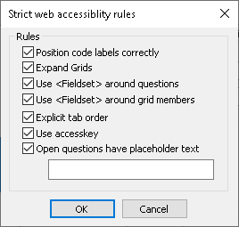
- You can also select to Use strict rules which provides further options to select in the Details settings. Information on these additional options is included in the list below.
- Once you have selected the strict rules options, click OK to return to the Questionnaire Properties dialog.
- Click OK to save the Accessibility options.
- Publish and test your questionnaire to check that the accessibility options are correct.
Explanation of the Accessibility Settings
Surveys to produce
This option allows you to select how the surveys will be published. The default setting is set by the survey template selected when creating the questionnaire.
The Standard Version Only option would publish a version of your survey that includes any colour, images and routing that you have applied.
The Plain Version Only option would publish a version of your survey that removes any colour, images and routing that you have applied.
The Standard and Plain Versions publishes both versions of the survey.
Web links
This option is only available if you have chosen to publish Standard and Plain Versions and creates link(s) at the top of the questionnaire for people to switch between the versions.
Link to plain text – This places a link to the plain text version at the top of the standard version of the questionnaire. The default is “Text only”
Link from plain text – This places a link from the plain text version back to the standard version of the questionnaire.
W3C Accessibility Options
Plain version uses no colour – the questionnaire appears in black and white, but this doesn’t mean you can’t apply a colour at all. You can apply a colour as long as it is in an appropriate contrast.
Plain version has no images – no images will be included in the plain version of the questionnaire, however the use of images normally causes no accessibility problems and the use of graphics is even recommended in some cases to make content easier to understand (checkpoint 1.1.1)
Plain version has no dynamic routing – dynamic content may not satisfy all web accessibility guidelines, for example skipping pages could cause confusion for assisted technologies. It is therefore recommended that a Plain version with no dynamic routing is selected alongside a standard version with dynamic content.
Strict web accessibility rules

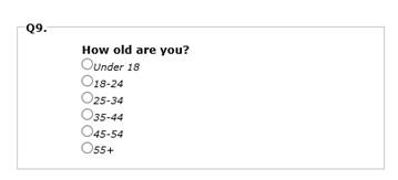
Position code labels correctly – Would position the code labels and boxes automatically in a single column enabling the assisted technologies to read down the questionnaire.
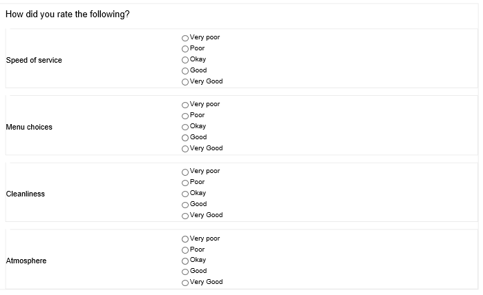
Expand Grids – It may be difficult for the assisted technologies to read grids as a grid format goes across the screen and not down. Ticking expand grids reformats the grid so it reads down the questionnaire.
Use <Fieldset> around questions – this is used to organise the content (checkpoint 2.4.10) by applying a border around the question which allows some assistive technologies to navigate more efficiently and to provide more useful information to respondents.

Use <Fieldset> around grid members – this is for assisted navigation and applies a border around the whole grid question which can aid readability. You can only apply ‘fieldsets’ to grid questions if the option for ‘Expand Grids’ has been selected.

Explicit tab order – Displays every link and control in the questionnaire in a logical order, however Snap web questionnaires are always arranged in this way, selecting this option will ensure this.
Access key – This allows you to use a combination of keys on the keyboard to perform the same action as pressing a button. The keyboard combination of Alt+R can be used for the reset button and Alt+S for the submit button. Access keys are no longer required for conformance to WCAG 2.2. Note: There are also some considerations when using keyboard combinations, for example Browser support is limited and they are not generally easy to use as many assistive technologies use many Alt keys combinations for their interfaces.
Open questions have placeholder text – You can convey the purpose of open ended text boxes in the questionnaire by adding appropriate placeholder text which is displayed inside open text boxes on screen. This placeholder text aids assisted technologies to present or convey the information, structure and relationships of the content on the page.
