Enhance the navigation buttons
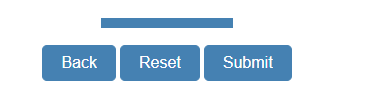
Navigation buttons let the respondent move through the pages of the questionnaire, and submit their response when they have completed it.
In Snap XMP Desktop, you can choose
- the button design
- which buttons to show on a page
- whether to include a progress bar
- the progress bar design
- whether to show the toolbar area
- the colour of the buttons, progress bar and toolbar area
Changing the buttons appearance
- In Snap XMP Desktop, open the survey from the Survey Overview window. This opens the Questionnaire window.
- In the Questionnaire window, click Questionnaire properties
 .
. - Select Buttons
 in the Section panel to display the buttons settings.
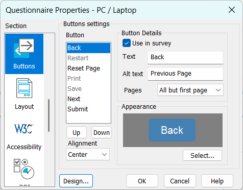
- In the Button list, select the button that you want to change.
- Select the Use in survey checkbox to show the navigation button.
- In Text, enter the text shown on the button.
- In Alt text, enter the alternative text, which is also used as the hover text.
- In Pages, choose which pages the button should appear.
- Use the Up and Down buttons to set the order the buttons are shown.
- Use the Alignment to position the navigation buttons on the page.
- Click Design to choose a style for your buttons. This opens the Navigation Design dialog.
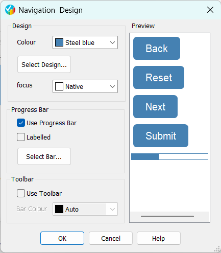
- Choose the button colour and focus colour. Click Select Design to select the design to use for all buttons.
- Select Use Progress Bar, if you want to show a progress bar. Click Select Bar to select the design to use for the progress bar.
- Select Use Toolbar, if you want the navigation area to be visible.
- Click OK to save the changes to the design. This returns to the Button settings. Click OK again to save all the changes.