Laying out a grid question for an online survey
When running a survey online, you do not have the same level of control over the way the surveys looks when compared to printing a paper survey. The questionnaire layout can look quite different when displayed on different monitors using different web browsers. It is worth checking the layout on a number of browsers, using different monitors and window sizes, before sending it to any participants.
Grid layouts can be affected by this and Snap XMP Desktop provides several tools to assist you in laying out grid questions and adjusting positioning of the separate elements.
This tutorial shows you how to adjust the layout of a grid question:
- Set the grid boxes so that they are vertically centred
- Hide the question number and remove the space left for it
- Change the spacing between the grid elements
- Adjust the page margins
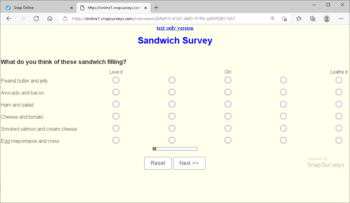
The original grid question before the changes is shown:
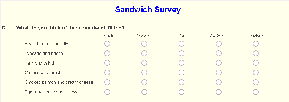
Step 1: Removing question numbers
-
In the Questionnaire window, click Style Mode
 .
.
- Select All Styles from the question style list. Any changes made will now affect all questions.
- Select Show from the toolbar topic menu.
- Select Name (for question numbers) or Grid Name (for grid question numbers) from the element list.
- Clear the Show box to hide the question numbers.

The question is shown with no question number:
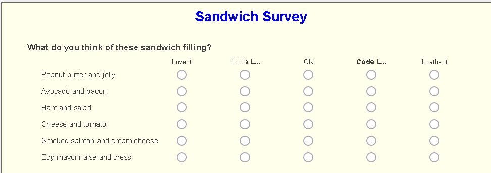
Step 2: Align response boxes vertically
The preview shows that the response circles are vertically aligned with the bottom of the row. You can change that by adjusting the alignment.
-
In the Questionnaire window, click Style Mode
 .
.
- Select All ‘Grid’ Styles from the question style list. Any changes made will now affect all Grid question styles.
- Select Alignment from the toolbar topic menu.
- Select Code Box from the element list.
- The first box (showing Center in the image) gives the horizontal alignment.
- The second box (showing Middle in the image) gives the vertical alignment.

- Set the vertical alignment to Middle.
Step 3: Adjusting the grid question spacing
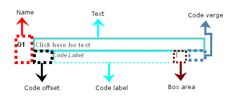
The spacing of a grid question is calculated proportionately to the browser window size. This is because you do not know how respondents will be viewing your questionnaire. You can define the amount of available space that is given to each element using the Tabs option. The diagram below shows the element names and the areas they affect.
Remove the space left for the hidden question numbers
-
Make sure that the Questionnaire window is in Style Mode
 . If you have switched to design mode in the mean time, click Style Mode
 again
again
- Select All Styles from the question style list.
- Select Tabs from the toolbar topic menu.
- Select Name from the element list.

- Reduce the space for the Name element down to 0%. This will move the questions to the left-hand side of the questionnaire.
The grid question is shown with the spacing removed:
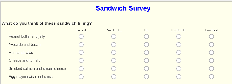
Increase the space between the grid columns and remove the right-hand space
The code gutter describes the space between the grid columns. Increasing the code gutter will increase the width of the grid and display the code boxes further apart.
The code verge describes the space between the last grid column and the right hand side of the questionnaire.
-
Make sure that the Questionnaire window is in Style Mode
 . If you have switched to design mode in the mean time, click Style Mode
 again
again
- Select All ‘Grid’ Styles from the question style list.
- Select Tabs from the toolbar topic menu.
- Select Code Gutter from the element list.

- Increase the space for the Code Gutter element to 15%.
- Select Code Verge from the element list.

- Reduce the space for the Code Verge element down to 0%. This removes the space between the question and the right-hand side of the window.
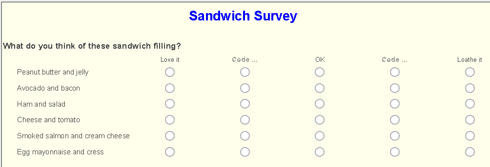
- Align the grid row labels with the question text by setting the Code Offset to 0%.
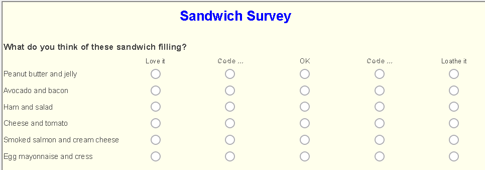
Step 4: Changing the page settings
-
Click Publish
 from the Questionnaire toolbar.
- Set the Method to publish your questionnaire to Preview only.
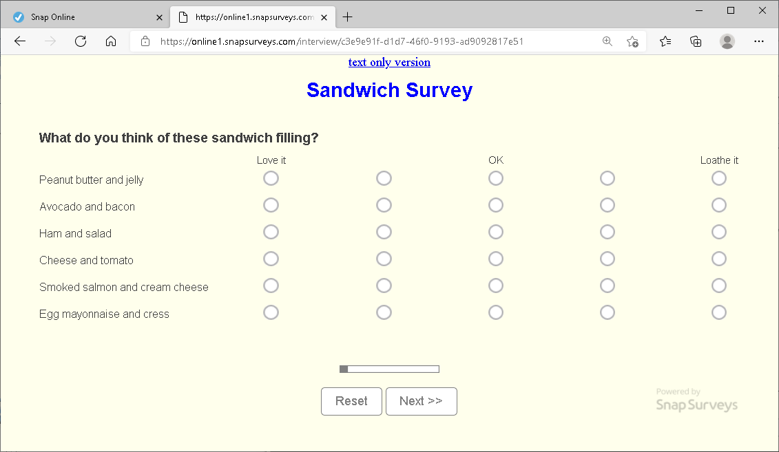
- Click the Publish button to display the questionnaire as it will appear to the participant. There’s still space between the edges of the window and the grid question in the published survey. This is set in the Margins option in Questionnaire properties.
-
Click
 to open the Questionnaire properties dialog.
- Select Margins in the Section list.
- Set all the margins value to 0px and click OK.
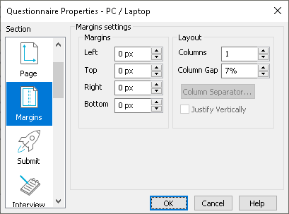
- Publish your questionnaire to preview again. Your grid question should now expand to fit the whole of the browser window.
If there is a topic you would like a tutorial on, email to snapideas@snapsurveys.com