Question carousels
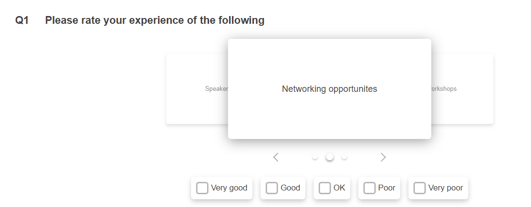
A carousel is another way of displaying a question that contains a number of rows, such as a grid or semantic scale. Each row is presented as a card showing the question and the respondent answers the card shown before moving onto the next one. The carousel can be set to move onto the next question automatically or manually by clicking navigation buttons. The respondent can navigate through all the cards to review their answers. There is also an option to show the count out of the total number of aspects to answer.
This question style is especially useful to present larger grids on smaller screens, such as smartphones and tablets, as the respondent only sees one question row at a time. This can also be helpful to ensure that a question row isn’t missed in a large grid as the rows are shown one at a time.
In Snap XMP Desktop, grid and semantic scale questions can be displayed in a carousel format. The question carousels are available for all online editions. The question remains displayed in the grid format in the questionnaire design but is shown as a carousel when run in a web browser as a preview or a live interview. The carousel appearance can be changed by setting the font, background colours and box style.
There is also a video introducing the question carousel at Question Carousel from Snap Surveys on Vimeo.
Creating a question carousel
The questionnaire must contain a grid or semantic scale question that can be shown as a question carousel.
- In the Questionnaire design window, select the Grid First or Semantic Scale First question.
- Select Show in the Toolbar Topic list
- Select As Carousel in the next drop-down menu and check the Show box. The question appearance does not change in the questionnaire design.

- Click the Options button to show the 2 settings:
- Select automatically display to set the next question to display automatically when the respondent has selected an answer for the current question.
- Select show count to show the current question row being answered out of the total number of questions in the carousel
- Repeat steps 1 to 4 for each online edition, as required, in the questionnaire.
-
Click Save
 to save the changes to the questionnaire.
Note that is advised that grids that display as a dropdown, which is often the case in phone and tablet editions, are changed to the standard grid box format before converting to a question carousel.
Testing the question carousel
The grid or semantic scale question appearance does not change when the question is changed to the carousel style. To test that the question carousel is shown in the required format you will need to publish the questionnaire in preview mode.
-
Click Publish
 icon on the Questionnaire toolbar.
- In Method, select Preview only then click the Publish button. This launches a test version of the questionnaire in a web browser.
- Check that the question carousel behaves as expected.

Changing the carousel appearance
The appearance of the carousel can be changed in the same way as other questions. You can change:
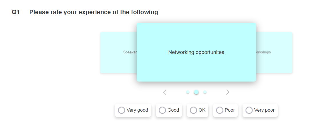
- Background color of the carousel cards
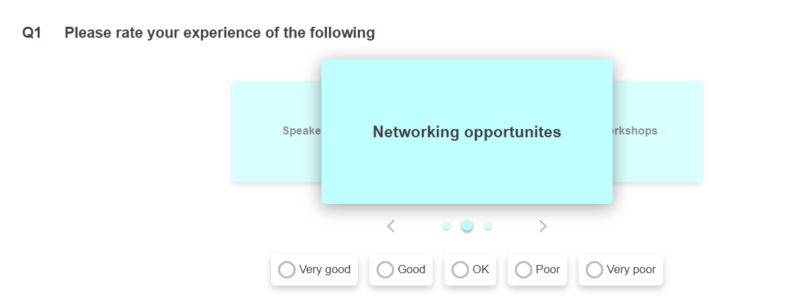
- Font of the question, grid label and box text
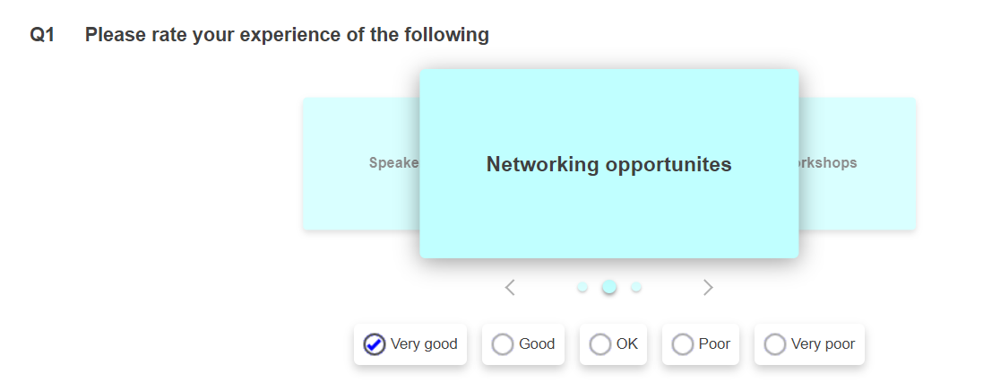
- Box style of the answers
- Show images instead of text
Changing the background
The background colour of the carousel cards is determined by the background colour of the grid label.
- In the Questionnaire design window, select the rows of the grid or semantic scale question.
- Select Background in the Toolbar Topic list.
- Select Grid label in the next drop-down menu.
- Click the Color button and choose a background colour then click OK

-
Click Publish
 icon on the Questionnaire toolbar.
- In Method, select Preview only then click the Publish button. This launches a test version of the questionnaire in a web browser. Note that the colour of the cards is the same as the background color of the grid label.

Changing the font
- Select the grid label then select Font in the Toolbar Topic list.
- Select the font options for the text.
- Repeat for each grid label, as required.

-
Click Publish
 icon on the Questionnaire toolbar.
- In Method, select Preview only then click the Publish button. This launches a test version of the questionnaire in a web browser. Note that the text of the cards uses the font set for the grid label.

Changing the box style
- In the Questionnaire design window, select the rows of the grid or semantic scale question.
- Select Boxes in the Toolbar Topic list.
- Select Images in the next drop-down menu.
- Click the Images button and choose a box style then click OK

-
Click Publish
 icon on the Questionnaire toolbar.
- In Method, select Preview only then click the Publish button. This launches a test version of the questionnaire in a web browser. Note that the answer selection options under the carousel cards use the box style.

Inserting an image on the carousel cards
- Select the grid label then select Font in the Toolbar Topic list.
- Click Insert then select Image.

- Browse to the image and click OK.
- Repeat for each grid label, as required.
-
Click Publish
 icon on the Questionnaire toolbar.
- In Method, select Preview only then click the Publish button. This launches a test version of the questionnaire in a web browser. Note that the card image is used from the grid label.