Types of chart
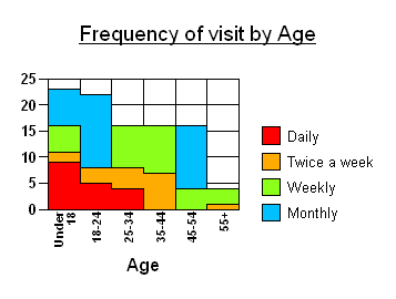
The most popular types of charts available, are shown here. Further styles are also available such as Gantt, Bubble and Hi-Lo.
Area charts
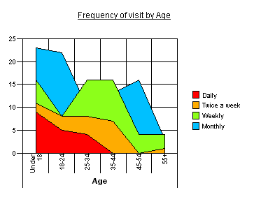
Area Charts are most often used to emphasise the relative importance of values over a period of time. An area chart focuses on the magnitude of change rather than the rate of change. Each filled area on the chart represents a series and is identified by a different color or pattern.
Bar charts
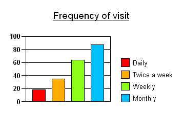
Bar charts are used to compare one item with another, or to compare multiple items over time. Each bar represents a cell value. This is the chart equivalent of a frequency table.
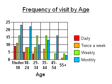
Clustered Bar Charts are similar to the more conventional vertical bar charts. They are the equivalent of a cross-tabulation.
Horizontal Bar Charts are similar to standard vertical bar charts, except that the categories are organised on a vertical axis and the values are plotted on a horizontal (y) axis.
Stacked Bar Charts are used to show how the main category is divided into smaller categories. This can be shown as number or percentage of the total amount.
Pie charts
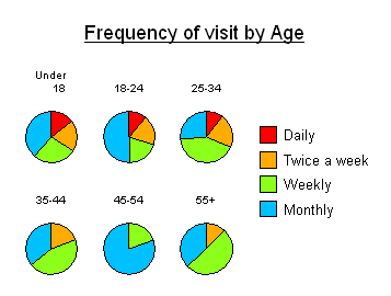
Pie charts show the relationship of parts to the whole. If multiple pies are displayed, then each pie represents a category, and each slice represents a value in that category. The example shows a pie for each age category, with segments for frequency of visit. Pie chart values for each segment are usually displayed as percentages.
Doughnut Charts are provided and their use is similar to pie charts.
Line charts
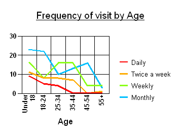
Line charts are best used to show changes over time. They emphasise time flow and rate of change rather than the amount of change.
Step charts
Step charts are used to compare items that do not show trends. They display distinct points along the value (y) axis, with vertical lines showing the difference between each point. The horizontal (x) axis shows categories.
